Recently, I had my students to complete a self-reflection in which I asked 'what is one skill you would like to walk away from the semester with?' One of the best answers I received was 'to draw like
Candice Olson of
Divine Design'. Wow...me too! Of the many designers making a career on television, Candice stands out in her ability to represent design ideas on paper through incredible hand renderings. This, in my opinion, makes her the real deal.
Below is a demonstration I gave students, based off a drawing method featured at the end of Divine Design, where a space is rendered from a photograph. In the assignment that grew from this demo, I encouraged students to draw one space several times, experimenting with color combinations to see what works and what does not.
:::::one:::::
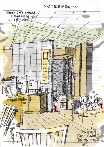
For this exercise, we'll work backwards. I'm beginning with an image from a
magazine, but you can work from a photo or digital model of any space you would like to see 'updated'.
:::::two:::::
The first step is easy. Place a sheet of translucent paper over your image and trace what you see. Don't worry about having rigidly straight lines. Exactness is not the goal, but rather expression. You'll notice, especially around the painting hanging on the wall, my lines extend beyond the boundaries of what I'm tracing. This aids in the crispness of the drawing. Feel free to change elements of the room at this point. There is no reason you can't make your own design decisions. Go ahead, add some tchotchkes!
:::::three:::::
Once finished with this step, I add some thicker lines using a wider tipped pen. I choose to add these thicker lines to surfaces and edges where I assume shadows will be. I've identified these areas based on the assumption that light is coming in through the window. However, this is where a photo reference can help.
:::::four:::::
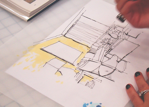
I then begin applying color with a Chartpak AD marker. I work quickly as the marker dries fast on the trace paper. It also helps maintain the loose look I'm working towards.
:::::five:::::
Say what?!? As this drawing was serving as a color study in my interior design class I'm bold with the color, attempting it to use combinations in unexpected [and often unsatisfactory] ways. But why not? It's just a drawing...
:::::six:::::
I like to embrace the process that goes along with this type of drawing. As a result, I test out the markers along the side of the rendering, with the intention to leave these trials in my finished presentation. I also joke with students about my unruly hand which can't help but leave marks all around the outside of the image.

:::::seven:::::
With the base colors down, it is time to add some shadow. Because of the nature of the paper and markers, if I were to try to add shadows on the front of the paper, the strokes would become diluted. Instead, I flip the paper over, adding dark areas to the backside which while shine through to the front.
:::::eight:::::
The result is a loose and quick vignette. This one took about 15 minutes from start to finish. A great way to present ideas in a hurry, this drawings can be further enhanced (and toned down a notch...or two) in Photoshop.
Find this helpful? If so, please share
the link with you friends!
See a past, tighter marker tutorial
here.
![an open [sketch]book](https://blogger.googleusercontent.com/img/b/R29vZ2xl/AVvXsEg_HdD3YzhuCut1ArE3LmNgh0RGlDpbiE9u8cZTYWBXFnk0q-bn0wh2u9g-7UuX2W8k9gFhOOOvmJuE9QrkK10wVGdhGoyhooDoOwvKjA3NzFrqEZeOSIjysj7-w4QsSvhpUc_g/s1600/aos_2020logo_banner_blog.jpg)